How Should AR Glasses UI Be Designed? Google Says: Don't Copy from Phones
Imagine a scenario: You're walking down the street wearing AR glasses, wanting to check navigation prompts.
But here's the problem—your background is moving traffic, flashing neon signs, and passing pedestrians.
And what's the design logic of phone UI? Fill the screen.
What kind of disaster would this be on AR glasses? Google finally has an answer.
Glimmer: Not a Design Language, But a Survival Guide
Last week, Google released a UI design language for AR glasses—Glimmer.
This isn't just a set of design specifications, but more like a "survival guide" drawn for AR developers.
Why say that?
Because the display environment of AR glasses is worlds apart from phones:
- Narrow display area: Not a full screen, but a small transparent area
- Background always changing: Today on indoor white walls, tomorrow in outdoor sunlight
- Limited battery capacity: Glasses need to be lightweight, so batteries can't be large
- Tight cooling space: Right against skin, temperature directly felt
So Glimmer's core approach is simple: Don't copy phone practices.
Outlines Instead of Color Blocks: To Save Power or to See Clearly?
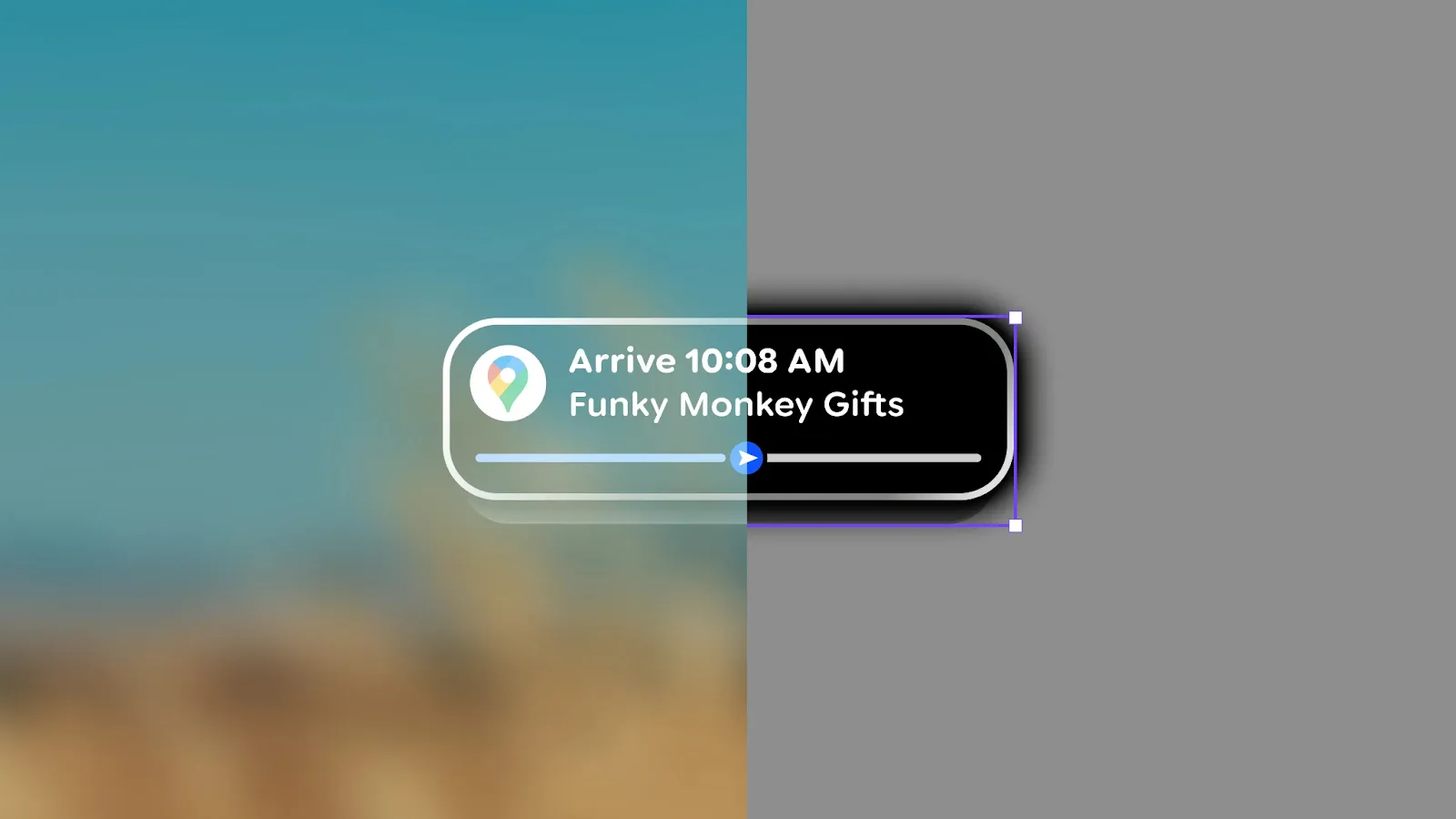
What's the most counterintuitive design principle of Glimmer? Use more outlines, less fill.
Phone UI is accustomed to using filled rectangular color blocks for buttons and cards. But on AR glasses, Google suggests directly using wireframe outlines.
Why?
On the surface, outlines "feel lighter" on transparent screens and won't completely block the real world.
But the deeper reason is very practical: Fewer lit pixels means lower power consumption and less heat.
If AR glasses can be under 50 grams, the battery might only be a few hundred milliamp hours. Every pixel that lights up erodes battery life.
This isn't an aesthetic issue, it's a survival issue.
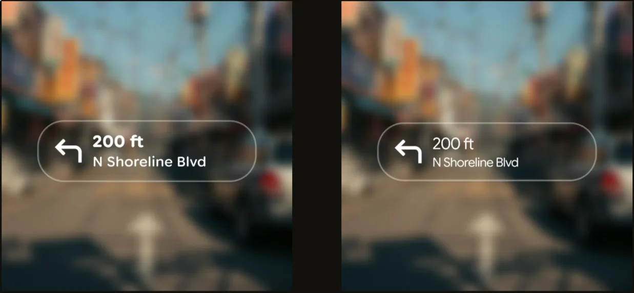
High Contrast, Bold Fonts, Wide Spacing: The Cost of Transparency
Transparent screens have a fatal weakness: uncontrollable background.
You view AR in the office, background is a white wall. Walk outdoors, background might be blue sky and green trees. Return home at night, background becomes dim indoors.
The same UI has vastly different readability on different backgrounds.
Google's solution? Three moves:
- Increase contrast: Contrast between text and background must be widened
- Use bold fonts: Thin fonts easily "scatter" on transparent screens
- Widen letter spacing: Leave more space between letters
The recommended font is Sans Flex—a sans-serif font specifically designed for digital screens.
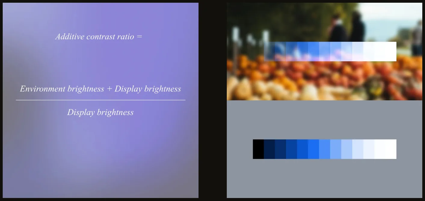
The Color Paradox: Bright Eye-Catching vs. Clear Visibility
On transparent screens, highly saturated colors反而会 "fade away".
What does "fade away" mean? Colors on transparent backgrounds look whitish, vague, and lack clear definition.
So Glimmer's design guidelines are clear: Less pursuit of saturation, more pursuit of brightness.
Simply put: Rather than making colors vibrant, make the overall display brighter.
This isn't an aesthetic choice by designers, it's a necessity of optical physics.
restrained Animations: Every Frame is Power
Smooth animations and flashy transitions on phones must be used carefully on AR glasses.
Why? Animation means continuous change of large numbers of pixels.
- More pixels lit = higher power consumption
- Higher refresh rate = higher power consumption
- Longer duration = higher power consumption
And glasses' batteries can't handle this consumption.
Glimmer's advice is direct: Fewer animations, shorter display times.
Information should be concise, disappear after viewing. Don't let UI occupy space unnecessarily.
This Isn't a "Design Guide", It's a "Physical Constraints Manual"
Reading through the entire Glimmer document, my biggest impression?
This isn't an aesthetic guide, it's a physical constraints manual.
Google puts it very directly: "Glimmer is not designed for AR glasses' appearance preferences, but to address actual technical constraints."
- Small display area → Simple menus, streamlined information
- Changing background → High contrast, bold fonts, wide spacing
- Small battery capacity → Reduce lit pixels, shorten display time
- Tight cooling space → Limit animations, reduce continuous brightness
Behind every design principle is a physical constraint.
Where Does Google Want to Take AR Glasses?
Glimmer is prepared for Android XR.
AI glasses running Android XR will launch this year. Google releasing UI design specifications half a year in advance sends a clear signal:
AR glasses are no longer experiments, entering mass production phase.
Previously developers each did their own thing, UI styles were all over the place. Now Google unifies standards:
- App developers have clear design references
- User experience has consistency across apps
- The entire ecosystem has a design language
When this kind of infrastructure begins to mature, it means the real product cycle is beginning.
Captain's Thoughts
Glimmer shows me something: AR glasses won't be a "shrunken phone".
It requires entirely new interaction logic, entirely new design paradigms, entirely new development thinking.
Those attempts to copy phone UI directly to AR glasses are destined to fail.
Because technical constraints differ, usage scenarios differ, user expectations differ.
For AR glasses to succeed, it must answer three questions:
- When to use? While walking, driving, in meetings?
- What content to view? Navigation prompts, notifications, AI conversations?
- How long to view? One second, three seconds, ten seconds?
Glimmer's answer is clear: Instant viewing, high contrast, lightweight display, rapid disappearance.
This isn't to show off, but to make information like road signs—present, but not intrusive.
When giants like Google start seriously considering "how AR glasses should be used" rather than "what AR glasses can do",
This industry might really be approaching a turning point.
Friends, the interface revolution of next-generation computing has already begun.
分享文章
3篇相关文章
Lamborghini Redefines Car Showrooms with Vision Pro, But You're Still Sitting in a Fake Car
2026-07-10
When technology lets you own everything in the virtual world, will you still pay for material possession in reality?
Meta Is Testing AI Glasses Without Privacy Indicator Lights
2026-07-09
Imagine a scenario: you walk into a café, and the person at the next table is wearing a pair of ordinary-looking smart glasses. You see no indicator lights flashing, but those glasses are recording audio and taking a photo every few seconds, capturing everything you do.
Even Realities Raises $150M: Not Making Second Pair of Eyes, Just First Screen
2026-07-07
Meta wants to cram cameras into every corner of their glasses, but Even Realities cut the camera completely. Yesterday this Chinese company secured a $150M Series B round led by Tencent and Meituan, reaching a $1B valuation.